This post was updated to include tips and strategies from digital marketing expert Lindsay Young, founder of Stormfree Agency.
Building a great website for your business is important because, more often than not, it is your first point-of-contact for many of your customers. As visitors go through the travel customer journey of dreaming, planning, booking and experiencing, you want to be discovered at the dreaming stage, considered in the planning stage, and ready to accept bookings and payments at the booking stage.
Today, the forever-connected modern traveller is likely to first discover you online. This is where your website plays a crucial role in guiding the traveller throughout their customer journey.
For a seamless and satisfactory experience, you need to consider two things when building your website: usability and user experience.
- Effectiveness: Can users achieve their objectives on your website?
- Efficiency: How quickly can users achieve their objectives on your website?
- Learnability: How easy is it for users to accomplish simple tasks the first time they encounter your website?
- Memorability: How quickly and easily can repeat users remember how to use your website in order to accomplish their goals?
- Error prevention/handling: How does the website help users recover from errors? Does the website implement defensive design?
- User satisfaction: Do users like using your website and recommend it to others?
User experience considers the steps taken for users to achieve their objectives on your website. For example, if a customer wants to find the itinerary for your multi-day tour, how can your website perfectly satisfy this goal as quickly and efficiently as possible? The last thing you want is a user giving upon on making a booking with you because it’s tedious to do so.
This is where user experience comes in. How can your website facilitate users to achieve their goals as quickly and efficiently as possible?
User experience is, therefore, an important part of the customer journey and can be the crucial factor that determines how many bookings you get on your website.
11 website improvements you can do today
1. Use white space
Having a lot of clear white space quickly elevates the experience of your website because it looks less cluttered and more professional. It also clearly directs users' attention to the main attraction of your website: your tours and activities.
According to Leanne Byrom, here are 5 ways white space can improve your website user experience:
- Prominence - Adding white space around a “Book now” button or around your tour description will make it stand out more.
- Comprehension - Adding white space between paragraphs and in the margins increases the comprehension of your content by 20%. It also makes it easier for users to focus and understand your content.
- Satisfaction - White space improves user satisfaction on your website, which positive effects spill over to your overall customer satisfaction.
- Clarity - Using white space to organise your content into blocks improves the legibility and readability of your content.
- Trust - A clean design, plenty of clear white space, signals professionalism and builds trust with your potential customers from the get-go.
Learn how to optimise your site to maximise website bookings.
2. Write clear headers
Let your users know what the website, your web pages and your blog posts are about with clear headers and titles. When crafting your headers, ask yourself these questions:
- What are my potential customers searching for?
- What are some keywords relevant to this blog post?
- How would my customers search for this on Google?
- What are the keywords they're likely to use?
3. Write even clearer tour and activity descriptions
Much like the images on your website (we'll discuss this in a second), the product description is the next best opportunity you have to entice people to want to book with you. It’s simply not good enough to write something like:
Join our food tour and try five favourite local dishes. A fun day out for everyone!
Your product description is one of the most important sales and marketing assets you have, so don’t brush it off. “If you don’t provide your visitors with detailed product features, then you certainly will lose your potential customers.” (Marketing Insider Group, 2017). Take time and craft a really great, clear description, because it’s worth it. You don’t have to be great with words to write a strong product description, either, you just need to include:
- Five unique selling points / benefits. Why is your tour / activity / B&B unique? Do you have exclusive access to a certain location? Are you the only property with a certain view? Is your max. group size smaller than the other tours in town? Write down five unique selling points for this product and ensure you incorporate them into the description.
- Five highlights. Similar to unique selling points, but think more about what the customer wants (instead of what you have). Does the tour include a spectacular view? Does your B&B have a dog? Does your activity feature kayaking down two different classes of rapids?
- A story. Why did you create this product? What can customers expect? Why are they going to love it?
- SEO-friendly keywords. Remember that in addition to capturing the attention of people already on your website, your product description can also help draw people in via search engines. Of course, don’t stuff your product description to the brim with keywords, but ensure that you’ve got at least five good ones in there.
- Inclusions and exclusions. Be as detailed as you can so that you manage the expectations of the customers.
- Cancellation and refunds policies. Be clear about when customers can cancel and receive a full refund, partial refund or not refund at all. That said, it is better to encourage customers to reschedule their tours than to offer them a refund.
- Health and safety measures. Reassure your customers that you're serious about health and safety and outline the steps you're taking to keep everyone safe.
A great way to structure your product description is to start with a short intro paragraph (about two to three lines), then list five highlights in bullet point form so they’re easy to read, then continue with a longer, more detailed description that creates atmosphere, establishes the tone, and incorporates your unique selling points.
Pro tip from Lindsay: Don’t give away the farm! You want to walk the fine line between giving customers enough information to convince them they want to book, without giving away your secrets.
4. Use great videos and images
When it comes to travel, images are your image. Purchasing travel isn’t the same as purchasing a new pair of jeans – you can’t try before you buy. As such, the images on your website (and social media) need to do the same job as a changing room with flattering mirrors: make it impossible to walk away empty-handed.
Every product on your website should have between eight and ten high-resolution, large size, professional-looking photos. These photos should illustrate every highlight of your product: a food tasting, a look-out, the equipment (ie. a canoe, bike, or kayak), and people enjoying the experience.
If you have a good camera and can take professional-looking photos, great. If you don’t, hire a professional. Don’t have a lot of money? Talk to a local arts college and see if there are any students looking to add to their portfolio.
We don’t recommend using stock photos because they won’t authentically represent your experience, meaning you’re setting the wrong expectations for consumers.
Once you have your photos, ensure your website is optimised for high quality photos. Ensure the photo size is large, that you have a caption for each photo, and that they’re clearly displayed on your product page.

5. Add social proof to your website
Social proof is so important these days. It signals credibility and is evidence that previous customers have had a good time on your tours.
Add social proof by adding customer reviews to your site using TripAdvisor’s free widgets. Alternatively, copy and paste customer reviews directly to your website.
In a webinar with Tim Warren, a long-time consultant for the tour and activity sector, his top tip for operators to improve website bookings rates is to convince website visitors that you have experience, you deliver high quality tours and they'll be in safe hands.
To do this, he recommends tour operators to add a "Defining/Credibility Statement" to their websites, ideally above the fold. This could be a simple statement that says "Serving over 1000 happy guests in 10 years", or "#1 adventure operator in Interlaken since 1990".
Learn more about the Tim's "Defining/Credibility" Statement in How to double website bookings and revenue.
6. Make your website mobile-friendly
The 21st-century forever-connected modern traveller is most likely to start researching for an upcoming holiday on their mobile devices. According to Google, 60% of “I want to get away" searches happen on mobile devices while 31% of leisure travellers report booking a trip on their mobile devices. That’s a lot of bookings.
As a tour and activity business, you want to make sure that your website it optimised for mobile devices to minimise the effort needed to search, inquire, book and pay.
Use Google's mobile-friendly test to check out how your website ranks or test out your site with Mobiletest.me to find out what your site looks like on different screen sizes.
7. Speed things up
When a user reaches your website, you’ve only got 15 seconds to capture their attention before they close the tab and move on.
Apart from writing engaging content, you also want to make sure that your page loads quickly. Analyse your page with Google PageSpeed Insights to find out how long it takes for your web pages to load and get recommendations on how to improve performance.

8. Have a clear "Book Now" button
Once a potential customer has read your tour and activity description, make it extremely obvious what the next step should be - to book your tour now.
Using a clear Call-To-Action will help you guide your customers along. Here are some tips to make your CTA button stand out:
- Use a contrasting colour for your “Book now” button.
- Use text that is short and simple.
- Place it strategically on your web page.
Read more: How to design and optimise your "Book Now" buttons
9. Invest in a seamless booking system
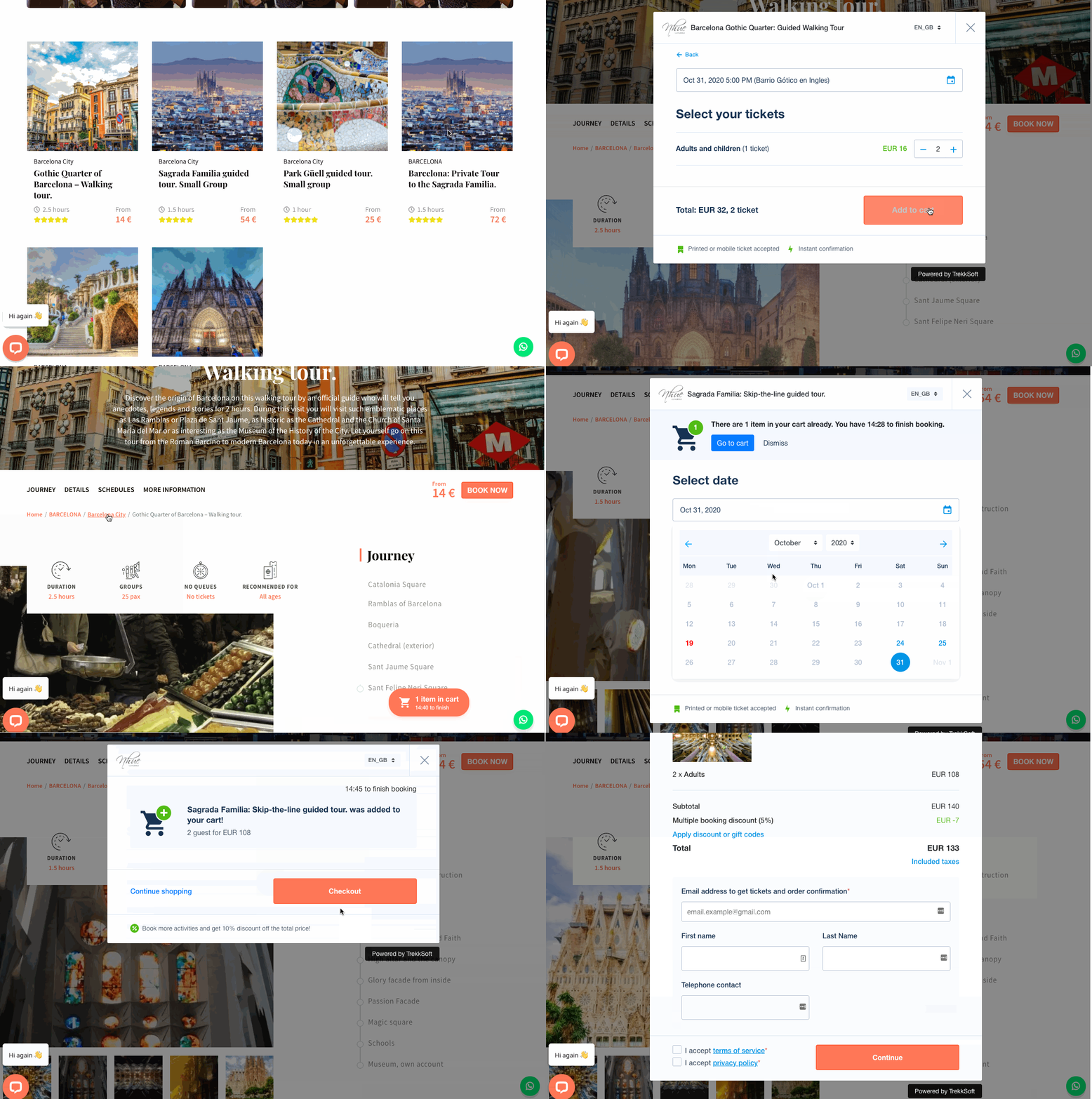
Why? To facilitate a seamless user experience. You should allow customers to book directly with you, any time of day, completing as little steps as possible. With a booking system that shows your availabilities in real-time, your customers can select the tour they want, at their preferred time of day.
When choosing a booking system for your website, here are a few things you should consider:
- What are the different ways to integrate this booking system to my website? Does this booking system offer an integration method that compliments my website?
- Can I easily upsell customers and get them to book multiple products or purchase tour upgrades?
- Can I add important questions to the booking form? Can I control whether these question are displayed before or after a payment is made?
- Can the booking system send out automated confirmation emails and receipts?

Not to toot our horns here but TrekkSoft offers one of the best booking widgets on the market. It's easy to add to your website and our user-friendly boking flow makes it easy for customers to select the right dates and times, upgrade their tours with add-ons like photo services or a lunch menu, and fill out important details about themselves like helmet size or pickup location.
Read more: TrekkSoft's Updated Booking Flow
10. Accept online payments
Create a seamless customer experience by letting your customers book and pay for your tour at the same time. Having them pay beforehand will give them one less thing to worry about when they’re on vacation. It reduces the risk of no-shows too.
Learn more about TrekkSoft's payment gateway
11. Get smart about landing pages
Landing pages are one of the most overlooked marketing tactics, which is a shame, because they’re one of the most worthwhile. Landing pages are, literally, the page people land on when they first come to your site.
One of your best opportunities to improve your conversion rate is to ensure that people are landing on your site on the right pages. To do that, you may need to create a few pages.
When you’re putting a link to your site in a social media post, ad, newsletter, or anywhere else, you want to ensure that the link you’re sending people to matches your messaging. The closer you match your link to your messaging, the better you’re managing the customer’s expectations as to what they’re clicking through to. The more you meet your customer’s expectations, the higher chance you stand of converting.
The more steps you create for a customer on the path to purchase, the more chances you have to lose them along the way. For example, if you’re promoting your mountain biking tour in Peru, you want to link to that product’s page. If you just link to your homepage, you’re forcing the visitor to navigate to the product page themselves, which could result in losing them as a potential customer.
If you’re posting about a special deal, you should have a page on your site just for the deal. If you have 10% off all of your tours in a particular country or city, you should link to that country or city’s product page. If you don’t have product pages for different categories of your products, that’s a change you can make to your site right now.
Words of wisdom from Lindsay: These website changes aren’t difficult to do. Yes, they’ll take time, but it’s worth it in the long run. If you work hard to ensure that you have high quality, professional-looking photos, thorough and compelling product descriptions, and are making smart use of landing pages, you’re four worthwhile steps closer to having a website that converts better.
Measuring your success
Measuring your success is important because it tells if you if these little tweaks are working, or not. These are some metrics you can easily track with Google Analytics.
1. Number of visitors
When reviewing your website visits, you want to take note of the number of total visits to your website each month, plus the top 5 to 10 pages that bring you the most traffic.
Then double down your efforts on those pages by adding clear call-to-actions and optimising the page for better user experience.
2. Bounce rate
According to Google, the bounce rate is the “percentage of visits that go to only one page before exiting a site”. This is an important measurement because it tells you if your website visitors are engaging with your content, signalling if the website improvements are effective.
3. Click-through-rates
How many people click on your “book now” button to start booking a tour?
This metric tells if the content on your webpage is working together with your call-to-action to encourage customers to make a booking with you.
Read more: 6 Key Performance Indicators for Tour and Activity Operators
In conclusion
To stay top-of-mind with your customers and to guide them through the travel customer journey, your website plays a crucial role. It should entice, thrill, and tease your potential customers, showing them what their next vacation could be like, only if they booked a tour or activity with you.
Your website is, therefore, your most important sales agent and you need to take care of it and invest in it to gain profitable returns.
Want more tips to improve your website to increase bookings?


