This is a guest post from Andrea Appin at TourismTiger, a web design company for tourism and activity companies (with a brilliant blog!)
So you have a website? Great start. You’ve invested time, effort and your hard-earned cash on generating a solid marketing campaign and online presence; you are leaps and bounds ahead of most of your competition. The thing is, even if you are getting a high rate of unique monthly visitors to your website – it probably still isn’t generating as many sales as it could.
Although this can be extremely frustrating, it’s a common problem faced by tour and activity operators around the globe – and most likely, the problem has nothing to do with you actual tours; the problem is your website.
Here are six tips to ensure your website generates more tour bookings:
#1 Make your headline glaringly visible and clear
If you have a bad headline, or no headline at all, you might as well not have a website. Glaringly visible and incredibly clear headlines will drastically decrease one of the most dreaded numbers on Google Analytics (bounce rates), while increasing visitor engagement.
So how do you make your headline glaringly visible? Start by making it big – really big. And make sure that they can see it without having to scroll down. In fact, besides the initial menu categories, it should be the first bit of copy on your website that anyone sees.
Next step, make sure that your headline clearly states exactly what your tour does. That means, this is not the time for creativity!
A San Diego based tour operator used the term, ‘California, A State of Mind’ as their headline. And while it’s catchy, the name in no way tells the viewers what they actually do.
Their current headline, ‘Everyday California Adventures: kayak, snorkel, stand up, paddle board’ leaves no doubt about what they do – and what viewers can find on their page.

#2 Use photos that sell
Whether you are offering up a tour in a hidden winery or showing off attractions of a historical city – tours are inherently visual. So there is no better way to sell someone on your tours than including an abundance of imagery on your website.
This might seem obvious, and while many tour operators do include pictures on their website, they are often doing it all wrong.
Avoid falling into this trap by following these easily implementable tips:
Make sure the pictures resonate with the audience: If you are starting out, you need to define your target audience, basically the people you could see taking your tours. Are they old or young? What do they look like?
Once you’ve defined this, you need to take pictures of people enjoying your tours that look like your target audience. Why should you do this? People want to envision themselves taking your tours. This will be a hard order to fill if they can’t relate to the people in the pictures.
Win them over with smiles: Again, whether your customers know it or not, the photos that they see on your website will convince them whether or not they will have a good time on your tours. So, imagine if you are having a good time – what kind of facial expression will you exhibit? Sullen, bored, happy or excited? Going with the latter two choices – those that portray positive emotions – will persuade any potential customer into believing that they will have a great time on your tours.
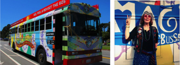
Take them on a sunny day: I don’t know about you, but my idea of a ‘perfect holiday’ isn’t punctuated by grey, gloomy clouds and rainy weather. I’m willing to bet that you probably feel the same way – and guess what? So do your potential customers. That being said, elicit the idea of a picture perfect holiday by taking your photos on a sunny day.
This tour operator in San Francisco got it right:
#3 Write better tour descriptions
Hopefully you’re starting to win your website viewers over with your headline and all of those great photos – well, at the very least you’ve intrigued them enough to make them dig a bit deeper and learn more about all of the great tours on offer.
The key idea here is to make sure that you include descriptions that are both scannable and comprehensive – while simultaneously including an answer to any and every question that they might have.
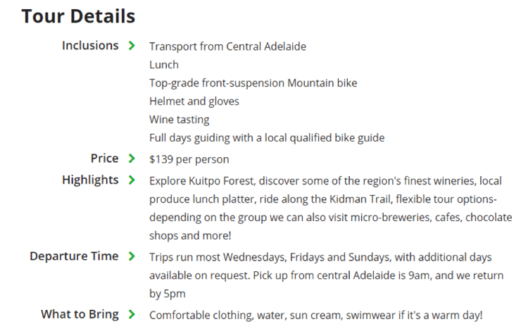
Start off by bulleting key details and then discuss the tour in greater detail in paragraph form. What should you include in those key details? Check out this example:
#4 Include booking buttons (and integrate them with booking software)
Nowadays, most people want to book their tours as easily and efficiently as possible. If they have to physically email or call someone about your tours, they’ll probably go back to their search and turn to a different tour operator who uses online booking software.
So how do you mitigate this? Make sure that you have booking buttons included on every single tour page. And the clear and obvious rule applies here too.
Your booking button should be extremely visible – it should be large and use a color that contrasts with your website’s overall color scheme. Better yet, make your booking button sticky. What does sticky mean? Basically when the website viewer scrolls up and down, the booking button will stay with them regardless of where they are on the page.
Last word of warning, make sure that you integrate the booking button with a booking software system, allowing any potential customer to purchase your tour in mere minutes.
Pro-tip: Not only does TrekkSoft integrate with most external payment gateways (such as PayPal), they also offer their own payment solution which will streamline the payment process for you exponentially.
#5 Add credibility with social proof
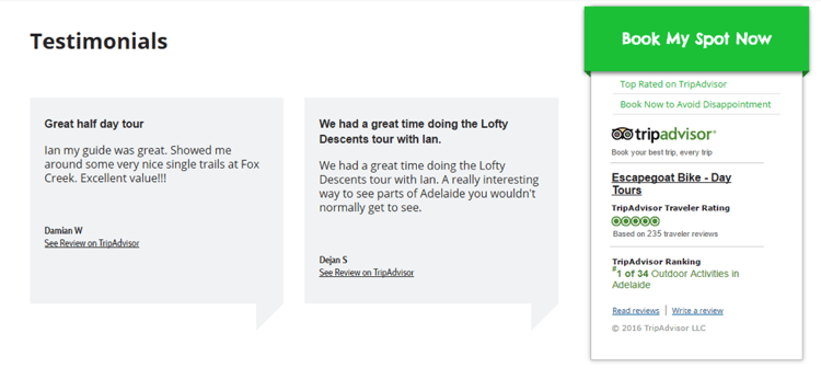
Social proof is basically a fancy term for testimonials and reviews. It’s the reason why you want to get more reviews and better reviews on TripAdvisor. You want people to know that other people – preferably a lot of other people – have had a great time on your tours.
And guess what? All of those reviews can be leveraged on platforms outside of TripAdvisor. That’s right – you can integrate them on your own site.
TripAdvisor provides (free) widgets, which is a great way to highlight all of your great tour reviews on your website.
Pro-tip: If you want to add even more clout to your reviews, integrate the TripAdvisor widget as close to your booking button as possible. TrekkSoft users can receive guidance from our support team on this.
#6 Make your website user-friendly
Hard fact: people view any given website for an average of 15 seconds. And with your clear headlines and strategically taken photos, your viewers should know that they are on the website that they want to be on.
So, what can you do to ensure that they stay longer than those crucial 15 seconds?
Optimize your website for mobile: Start by making it mobile-friendly, because no one, I mean no one, will stay longer than 15 seconds if they are accessing your website on their smartphone and it doesn’t load properly.
Make it win the race: If your website is following the tortoise’s philosophy of slow and steady being better, than you and your tour bookings will suffer severely. So you need to make sure that your website is fast. How fast? Well, if it takes more than two seconds to load a webpage, you will lose up to half of your website visitors.
If you want to speed things up, make sure that you test your website with Google PageSpeed Insights. They’ll tell you how fast (or slow) your website is running and they’ll give you a bunch of actionable tips that will help you increase your website’s overall speed.
Improve navigation: People want to have an obvious place to click on when they enter your website. So give it to them! Provide a tour menu directly after your headline and main photo. Make sure that the menu is intuitive – provide clear labels about the tours and include ‘view now’ buttons.

The bottom line:
Nowadays, the number of people turning to the internet to book their tours is growing at an insane rate. The unfortunate thing is, many tour operators just haven’t developed a good enough internet presence to capitalize on all of these potential customer – and building an effective internet presence is underpinned by having a website that is optimized to increase your tour bookings.
Use these tips, get ahead of the game and start selling those tours!
Want to boost your quality web traffic? Here's a free checklist to level up your website:

