Last November, we launched TrekkSoft's brand new look.
For long time users, you’ll see that we’ve refreshed the user interface and made small but thoughtful tweaks throughout the software to deliver a better experience.
Here are some of the big changes you should know about.
Top menu
Old menu

New menu

When you first log in to TrekkSoft, you'll land on the dashboard. The top menu bar looks a little different. Firstly, we've moved the the search bar to the top, where you can look up a booking, guests, agents, vouchers, and payments based on a name, basket ID, email address and so on.
In the "Design and Page" tab, you'll find everything you need for the website builder, designing the booking widget, accessing email templates, uploading files, and more.
Next up is "Merchant Settings" where you can view all the settings for your account including user accounts, payment gateway, and details about your TrekkSoft account.
You'll also find the Help section (that leads you to our Support documentation, tutorials and Community), Notifications, and your profile.
Moveable Help Desk
We've moved the Help Desk to the bottom left of the screen so that it doesn't get in the way when you are analysing important information. What's even better is that you can move it around too! Simply click and drag it to a spot you prefer.
Watch our video tutorial to get a full introduction of our new TrekkSoft design.
Product pages
We've made the most changes to the Product section, starting with its name. Previously called "Inventory", we changed it to "Products" to reflect a more sophisticated tour and activity market.

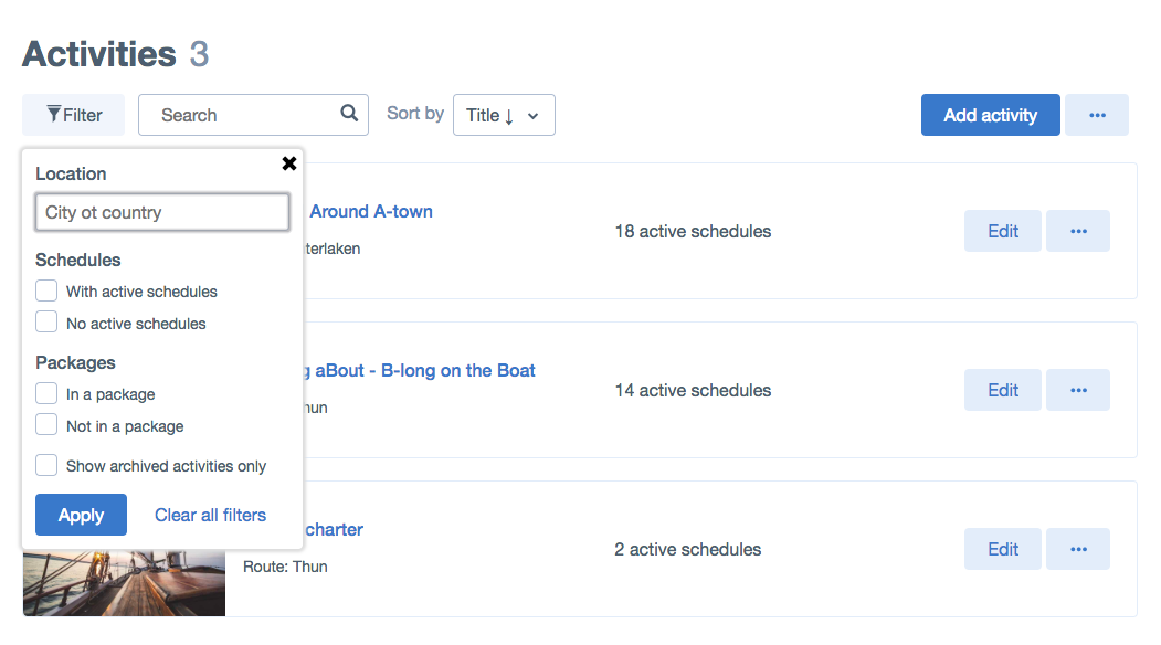
In the Activities overview page, we added a few things to make it easier for your to view and find the activities you're looking for. Firstly, we created a filter which you can use to view activities based on location, schedules (active or inactive) and whether its in a package.
We also added a search bar and a "sort" function allowing you to organise your activities by name in alphabetical order, or the the reverse.

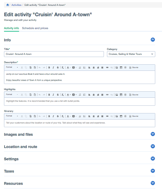
In the Edit Activity page, we reordered the sections so that the writing and content heavy parts are up top for you to complete first, followed by general set up options below.
We also decided to adopt a more condensed layout in these pages, allowing you to quickly get to the sections you need without having to scroll down an endless page or click back and forth to get to the information you're looking for. Simply click on the section you need and it'll expand to display the relevant details, options and settings. This also goes for the Schedules and Prices section.
What to expect in 2019

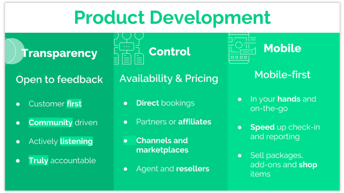
We have big plans for 2019. We want to use our position as independent provider to build a booking system that benefits you and your business.
While we continue to work on TrekkSoft back-end, to improve the functionality and usability of the system, we'll also improve our booking tools, whether it's our mobile app, the POS desk or our booking widget.
We also want to give you full control over your availabilities and pricing across all sales channels, whether it's working with online travel agents, resellers or in-destination booking agents.
Finally, we will focus on speeding up the reporting process to make sure that you have up-to-date and meaningful data that helps you make business decisions that drive profits.
We're committed to becoming your long-term business partner, will you join us?


